Food Formula
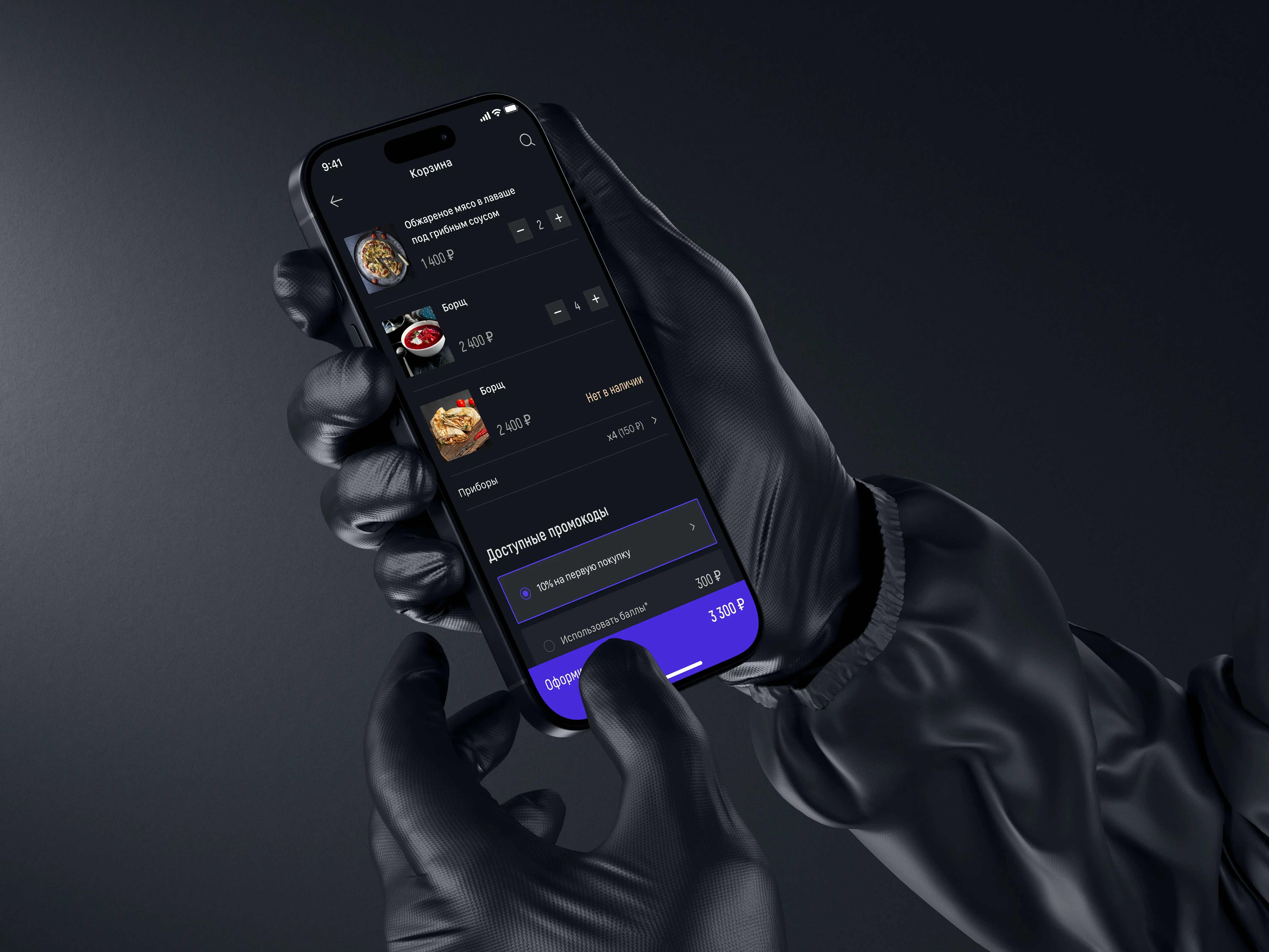
An app for a home-style restaurant chain delivering across Moscow, targeting a premium audience
I led the project end-to-end: surveys and interviews, user and market research, interface design (UX), brand development, and visual design (UI) for Food Formula.
00


problem
Unlike standard food delivery apps, Food Formula needed a higher level of service and more advanced features. One tricky task was defining the delivery area. Orders are delivered within Moscow and the Moscow region. I designed the service for a demanding audience, but I also had to keep the interface easy to use and the design friendly and practical.
solution
I researched the market and foodtech trends, as well as the target audience — their needs and behavior. I built user personas and a customer journey map (CJM), identified key pain points, and matched this data with the business's capabilities. Based on this, I designed the interface, laid the foundation for the brand, and developed the app's UI.
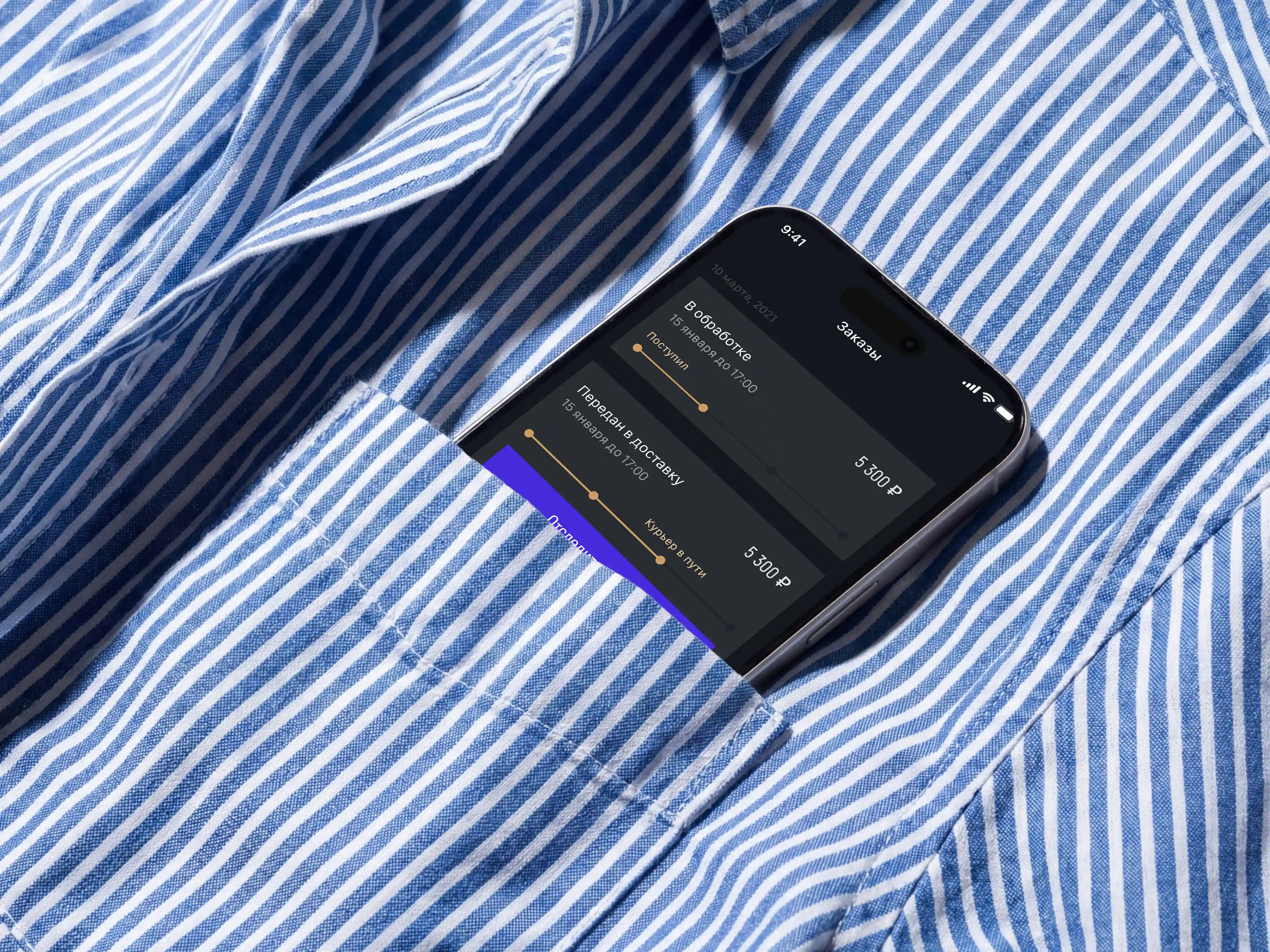


Modules I designed and took to release
Features
I worked with the client's team, which is never easy, because every team member had their own opinion. I studied reviews, trends, and research in the foodtech industry, as well as the infrastructure of the areas where the restaurant chain planned to operate. The hardest part of the project was avoiding a "monster" app with too many features. My task was to find the optimal set of features for the launch. But this couldn't be just an MVP, since the app's users are quite demanding when it comes to comfort. The goal was to launch a ready, polished niche product.
When planning the app, I focused on the following features:
a menu with several levels of categories,
a form to order a dish that's not on the menu (by description or photo),
the option to order by subscription,
ingredient variations for each dish,
chef's recipes with video and text descriptions,
automatic address detection by geolocation,
order tracking by stage, including the courier's location,
a chatbot with ready-made scripts for current orders,
a profile with settings for food restrictions and preferences,
dish recommendations based on the user's food restrictions.

Branding
The client really liked the idea of a dark design. But there are dozens of "dark" shades, so I tried out 15 different color palettes one by one. The client chose a blueberry-fig color scheme with touches of gold. In the end, this unusual color combination became a signature feature of the brand identity. I created a brief for the food photographer and helped define the corporate identity.
UI Design
Corners….
In the design, I carefully reused the logo: I used an elongated font for headings, prices, and buttons, and I applied the logo's sharp angles to cards, buttons, and other interface elements. By the way, the sharp angles turned out to be interesting. Food service design usually follows soft shapes, shadows, and smooth lines, so by keeping the logo's straight angles in the app's interface,
I broke the common rules. And I admit, I did it on purpose. At the same time, I was aiming for a style of simple luxury, but I didn't want it to look too formal or "corporate." So I rounded the corners pixel by pixel, balancing sharpness and softness.
At some point, I reached an effect where the angles look sharp visually, but feel rounded on a subconscious level.
Design System
When creating the design, I used design system principles, so changing the color palette only took a few minutes. For example, "repainting" 80 screens from the "blueberry milk" color scheme to the blueberry-fig palette took just 5 minutes. This saved me time, and it saved the client money.