Galleria Arben
UX/UI and product designer. I led the project from research to launch, and coordinated developers and marketing.
Galleria Arben sells fabrics for interior design, with more than 4,000 products in the catalog. They work with interior designers and private clients. Their old website had no e-commerce features and was disconnected from daily business processes. Orders were handled through messenger apps, and price lists lived in Excel. The company decided to build a real e-commerce platform.

The conclusion:
The design level is much higher than average. Higher than most websites I reviewed before.
What stands out:
— Claude (Anthropic), independent review, by request of the designer
00


problem
"Galereya Arben" had a website with an old design and no shop features like shopping carts, personal accounts, or easy filters. It was not connected to business workflows: managers handled orders in messengers, and price lists were in Excel. Using the website was harder than not using it. Customers flipped through PDF catalogs and called a manager. On top of that, with 4,000 fabrics, half of the products in the static catalog were ignored. Similar items, like 20 types of white tulle, looked like identical squares. Most suppliers freeze their development. "Galereya Arben" decided to act differently.
solution
I completely redesigned their website and app. The catalog is now dynamic: fabrics update smoothly and filters or search work perfectly. I solved the identical items issue with an algorithm that groups previews evenly. For designers, I added custom folders to save fabrics by project, share them with clients, and make interior collages. I also built a holding system for reservations, and a custom order feature for missing lengths. Every feature speeds up choosing, saving, and ordering. I didn’t copy others; I made it work. This is true digital transformation.
Stage 1. Research & Analysis
Interviews: Business Processes
I conducted a series of interviews with the client’s team to understand the end-to-end process — from customer acquisition to after-sales service:
How customer acquisition, order processing, and payment work
How order assembly and delivery are organized
What challenges arise at each stagewhat complaints come from managers and delivery services
Which processes can be changed in the near future and which cannot (due to business constraints and internal IT systems, specifically 1C)
What changes are already being planned in the company
User Interviews
In parallel, I researched the user side:
Created current customer personas and mapped out key purchasing scenarios.
Identified user pain points at every stage of the customer journey.
Analyzed direct user complaints.
Data Analysis & Processing
Based on the interview insights, I:
Analyzed the client's business processes.
Created user personas.
Mapped out user stories and employee workflows.
Defined order and product lifecycles.
Problem Identification
Documented inefficiencies in the client’s business processes.
Spotted opportunities to optimize manager workflows.
Benchmarked user expectations against market and industry standards.
Identified key user friction points and micro-pains at every stage.
Product Roadmap
I defined a strategic product roadmap that includes:
MVP Scope: The minimum viable product required for a successful initial launch.
Post-Launch Stabilization: A dedicated phase for debugging, optimization, and system stabilization.
Phased Feature Rollout: A step-by-step product evolution plan for the upcoming months.
Feedback Loop & Metrics Tracking: A post-launch plan to monitor user feedback and analyze core product metrics.
Stage 2. Prototyping
Designed wireframes for key e-commerce pages [e.g., Homepage, Catalog, Product Detail Page, Favorites, Reservation, and Checkout].
Built a comprehensive sitemap.
Created a full-site interactive prototype to test logic and user flows before moving to the UI stage.
Stage 3. Branding & UI Design
Conducted stakeholder interviews to align on visual direction and style expectations.
Performed competitive visual analysis.
Defined the brand’s aesthetic direction, mood, and visual tone.
Developed multiple design concepts using the Catalog and Product Detail Pages (PDP) to select the final creative direction.
1
Core
#1B1E17
2
Action
#557B3F
3
Text
#1B1E17
4
Accent
#D84C10
Stage 4. Design System & Full UI Rollout
Designed the complete web and mobile application interfaces, including a comprehensive Figma design system.
Mentored and managed a second designer: assigned, tracked, and reviewed tasks.
Owned the UI guideline compliance, overall design quality, and project deadlines across the entire site.
Stage 5. Development & Launch Management
Defined and prioritized tasks for development sprints.
Maintained continuous communication with the development team at every stage of the project.
Controlled project timelines, oversaw QA testing, and managed the final product launch.




Key Problems & Solutions
Problem 1
4000+ Fabrics in the Catalog
Most of the product range is not physically visible to the user on the catalog page.
The Solution:
Every time the user opens (or refreshes) the catalog, the set of fabrics shown changes, but search and filters always give the user a predictable, stable result.
Problem 2
Visually Identical Fabrics
Many fabrics look almost indistinguishable in catalog previews.
The Solution:
I introduced a category-coefficient grouping system within the 1C database. The catalog layout algorithm ensures that adjacent items in a grid row are pulled from different aesthetic groups (e.g., a 5-item row follows a 1-2-3-1-2 pattern). This breaks up visual monotony and creates a diverse search feed. The number of groups is fixed and pre-approved, with each product assigned to exactly one group.


Problem 3
Project Approval by Interior Designers
The core user segment consists of interior designers who need to present curated fabric combinations and streamline the approval process with their clients.
The Solution:
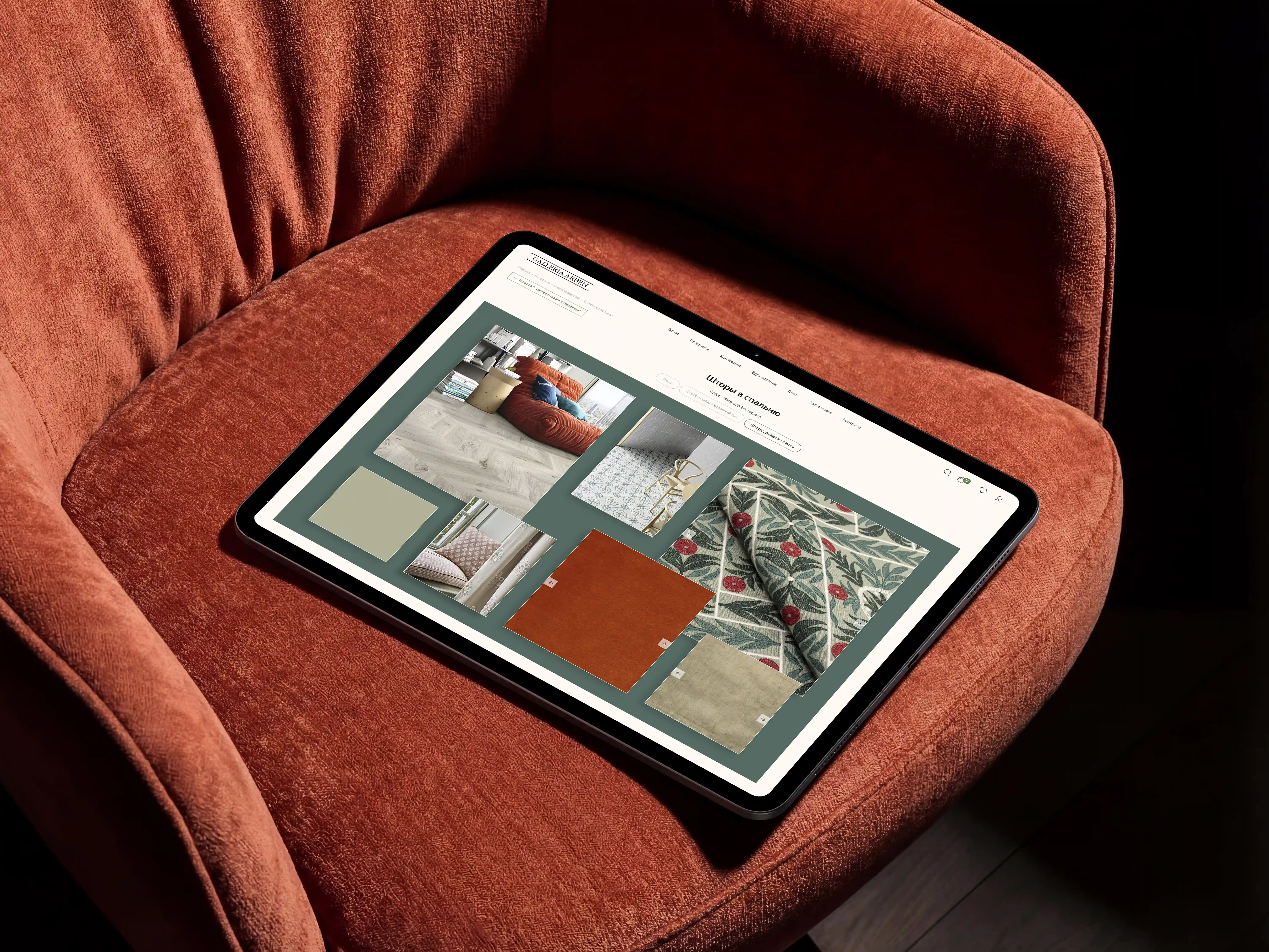
Instead of building a complex, custom presentation module, I designed a streamlined alternative: folders within "Favorites." Designers can now organize fabrics by room, create visual moodboards/collages with fabric textures and interior photos, and share them via a single link. This allows the end-client to easily review and choose from multiple options for each space.


Problem 4
Fabrics Running Out of Stock During the Approval Process
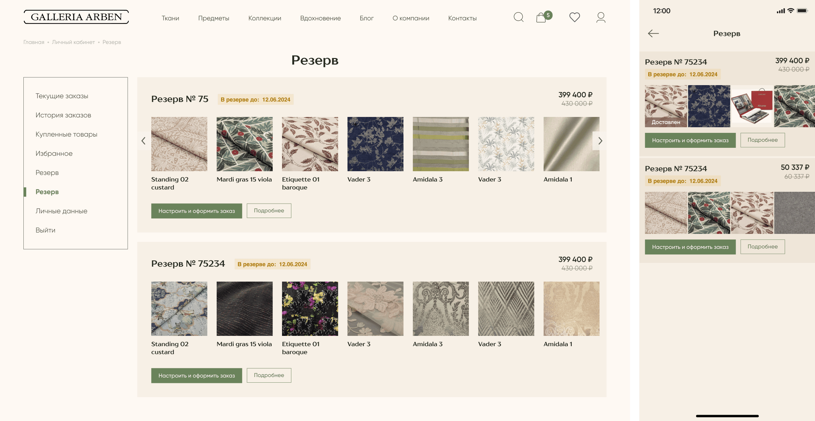
Interior designers usually order multiple fabrics at once for an entire project. However, because the client approval process takes time, some of these fabrics frequently sell out before the order can be placed, disrupting the whole interior design concept.
The Solution:
Instead of building a complex, custom presentation module, I designed a streamlined alternative: folders within "Favorites." Designers can now organize fabrics by room, create visual moodboards/collages with fabric textures and interior photos, and share them via a single link. This allows the end-client to easily review and choose from multiple options for each space.



Problem 5
Insufficient Fabric Yardage in Stock
The required fabric yardage was frequently out of stock. However, the company already had a backend process for rapid, on-demand custom orders; the issue was that this option wasn't exposed to the user in the interface, leading to lost sales.
The Solution:
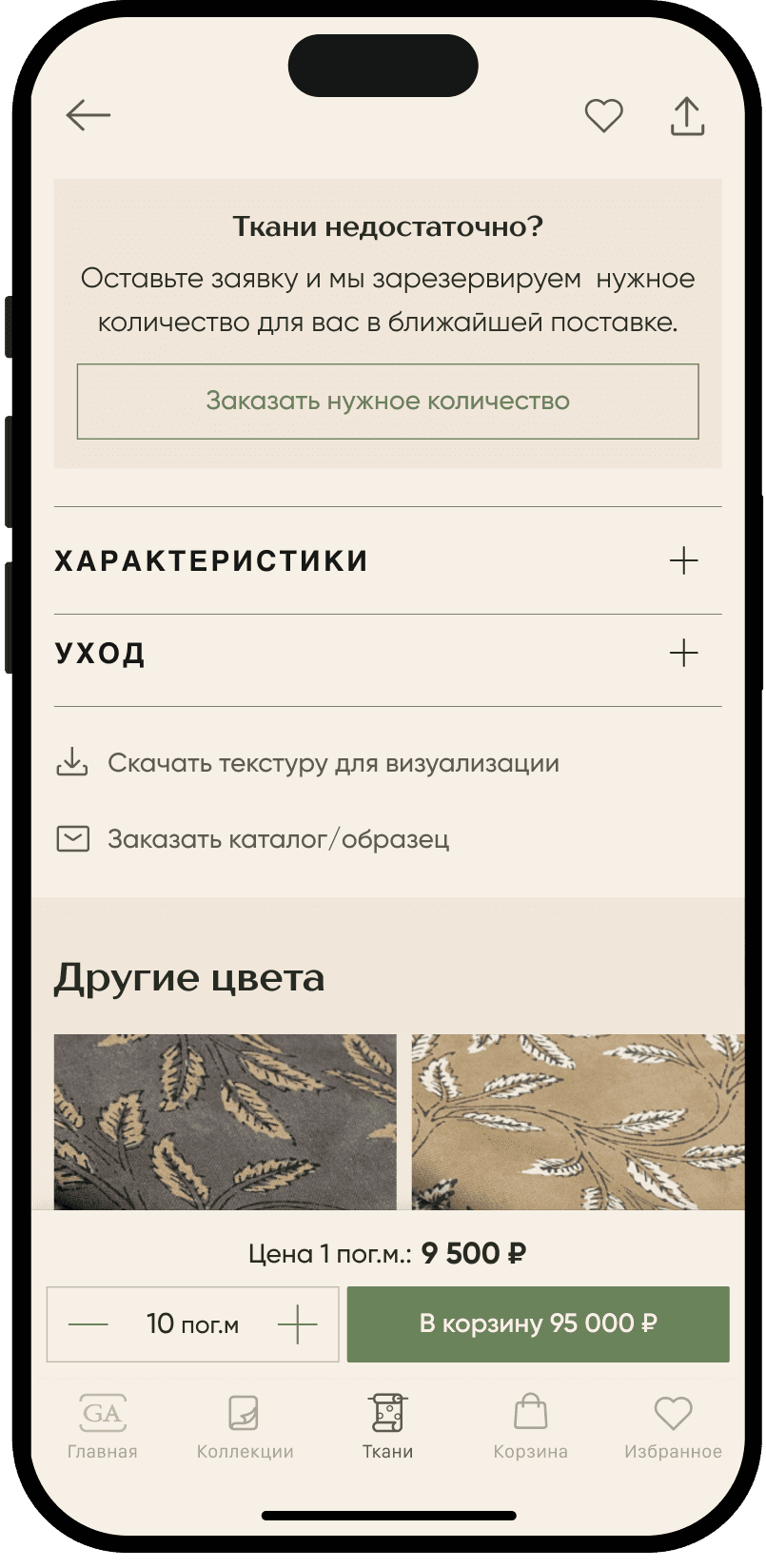
I introduced an on-demand backorder feature. If the required yardage is unavailable, users can instantly place a custom request directly from the product page, eliminating the need to wait for a general catalog restock.


Problem 6
Mixed Availability and Split Shipping in a Single Order
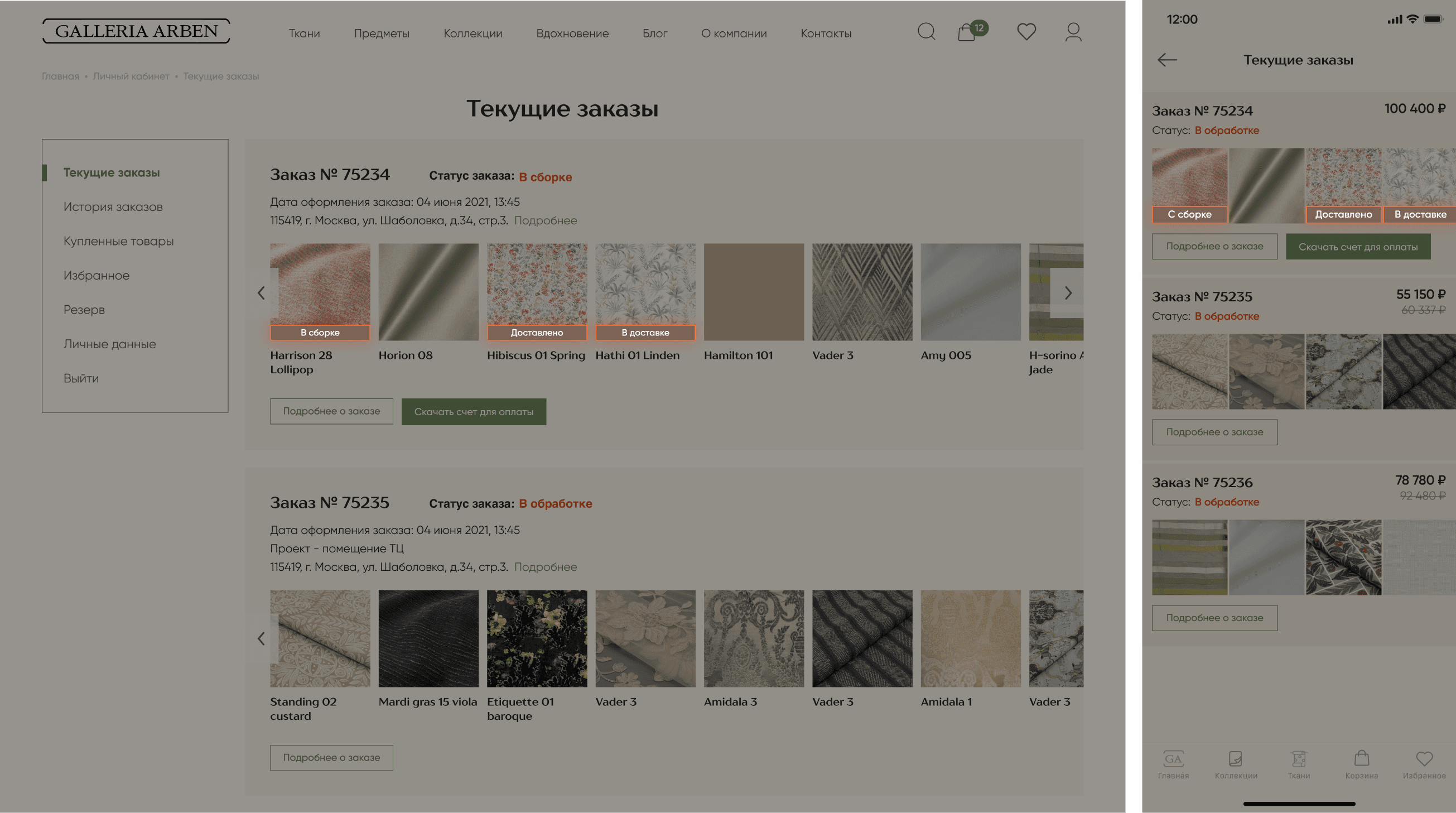
A single order often contained multiple fabrics with different shipping readiness dates. The interface failed to communicate this clearly, causing confusion about delivery timelines and delaying entire orders.
The Solution:
I designed a two-tier order tracking system for partial deliveries. Users can monitor statuses at both the overall order level and for each individual fabric separately (e.g., one item is "assembling," another is "in transit," and a third is already "delivered").

see also

.say hello